In the wake of the COVID-19 pandemic, data-driven insights have become more critical than ever. At Data Bi, we are committed to providing powerful solutions to help organizations make informed decisions. Today, we are excited to introduce you to our latest creation – the COVID-19 Live Dashboard built using Tableau.
Key Metrics that Matter
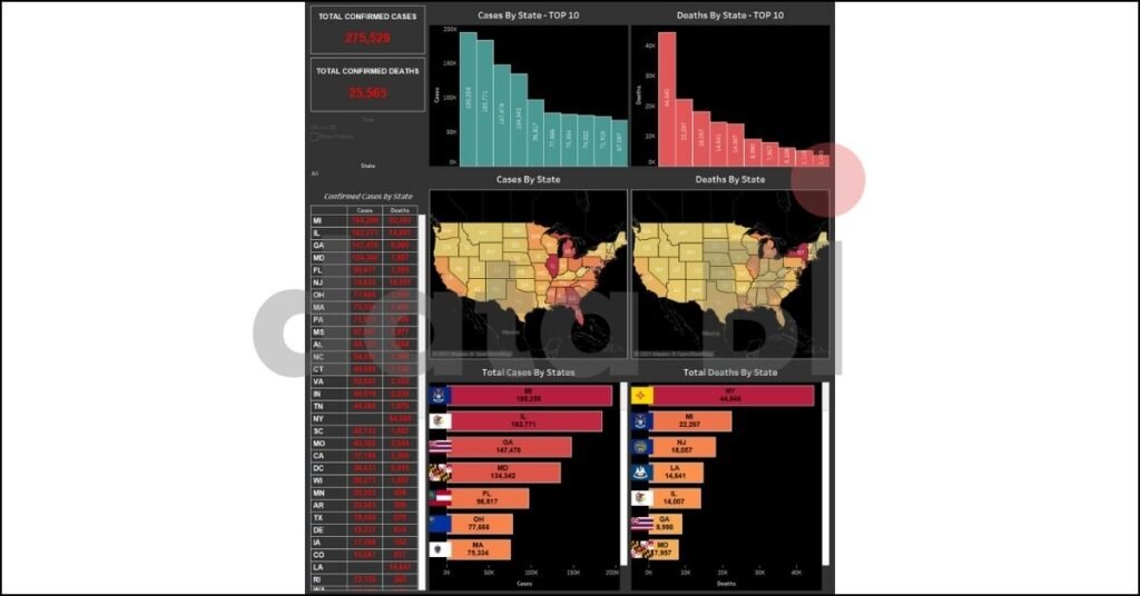
Our COVID-19 Live Dashboard is designed to provide a real-time snapshot of the pandemic\’s impact across the United States. It tracks essential key performance indicators (KPIs) that offer valuable insights into the spread of the virus. Here are some of the vital KPIs featured on our dashboard:
Total Confirmed Cases: Stay updated with the latest numbers of COVID-19 cases nationwide.
Total Confirmed Deaths: Monitor the unfortunate toll of the pandemic in real-time.
Confirmed Cases by State: Get a state-by-state breakdown of confirmed COVID-19 cases.
Top 10 States by Cases: Discover which states are experiencing the highest number of cases.
Top 10 States by Deaths: Identify the states with the highest reported deaths due to the virus.
Interactive Insights at Your Fingertips
What sets our COVID-19 Live Dashboard apart is its interactivity. We\’ve incorporated several features that allow users to tailor their data exploration:
State Filters: Customize the dashboard by selecting a specific state to view detailed information and trends for that region.
Date Filter: Track the progression of the pandemic over time by adjusting the date filter.
Visualizing the Data
Our Tableau dashboard leverages the power of data visualization to make understanding the pandemic\’s impact more accessible. Here are some of the visual elements that enhance your data exploration:
Maps: Interactive maps display COVID-19 cases and deaths by state, providing a geographic perspective of the virus\’s spread.
Bar Graphs: Bar graphs visually represent the total cases and deaths by state, making it easy to compare data at a glance.
The Value of Real-Time Insights
The COVID-19 pandemic has underscored the importance of staying informed and making data-driven decisions. Our Tableau dashboard empowers organizations, healthcare professionals, and the public with up-to-the-minute information on the virus\’s trajectory.
Why Choose Our COVID-19 Live Dashboard?
Accuracy: We source our data from reliable, authoritative sources to ensure accuracy and credibility.
User-Friendly: Our user-friendly interface makes it easy for anyone to access and interpret critical COVID-19 data.
Customization: Tailor the dashboard to your needs with state and date filters for a personalized experience.
Responsive Design: Access the dashboard on various devices, ensuring data accessibility on the go.
As the world continues to grapple with the pandemic, our COVID-19 Live Dashboard with Tableau remains a valuable resource for tracking the virus\’s progression. Stay informed, make data-driven decisions, and together, we can navigate through these challenging times.
Explore our COVID-19 Live Dashboard today and empower yourself with real-time insights.


